Logo Edit
Comment
This version of the logo can be used on solid colors and photos. It is currently not in use anywhere on the website.
Comment
The watermark is used to add depth to designs. It is often scaled back to 25% opacity and can be rotated slightly to create a more playful effect. (In the footer, it is rotated -30°.)
Comment
Greyscale should only be used if the logo is shown alongside other logos that are also in a greyscale format or if only one color is allowed for printing purposes.
Colors Edit
- #3c9ef2
- RGB (60, 158, 242)
- CMYK (75, 34, 0, 5)
Comment
Use:
Hat color in logo, buttons, links
- #2d76d8
- RGB (45, 118, 216)
- CMYK (79, 45, 0, 15)
Comment
Use:
Icons
- #e39062
- RGB (227, 144, 98)
- CMYK (0, 36, 56, 10)
Comment
Use:
Background color behind head shots, background color behind icons, accent color in icons
- #f0bb59
- RGB (240, 187, 89)
- CMYK (0, 22, 62, 5)
Comment
Use:
Background color behind icons, quotation marks
- #ffffff
- RGB (255, 255, 255)
- CMYK (0, 0, 0, 0)
Comment
Use:
Light backgrounds
- #f6f4ee
- RGB (246, 244, 238)
- CMYK (0, 0, 3, 3)
Comment
Use:
Light backgrounds
- #ebf3fa
- RGB (235, 243, 250)
- CMYK (6, 2, 0, 1)
Comment
Use:
Light backgrounds
- #e6e7e8
- RGB (230, 231, 232)
- CMYK (0, 0, 0, 9)
Comment
Use:
Outlines
- #abb7c7
- RGB (171, 183, 199)
- CMYK (14, 8, 0, 21)
Comment
Use:
Inactive states
- #5b6a80
- RGB (91, 106, 128)
- CMYK (28, 17, 0, 49)
Comment
Use:
Tertiary buttons (i.e. the button in the subnav)
- #273d59
- RGB (39, 61, 89)
- CMYK (56, 31, 0, 65)
Comment
Use:
Dark backgrounds, navigation bar
- #111c2b
- RGB (17, 28, 43)
- CMYK (60, 34, 0, 83)
Comment
Use:
Headings and body text, secondary dark background (i.e. the subfooter)
- #327af8
- RGB (50, 122, 248)
- CMYK (79, 50, 0, 2)
Comment
Buttons (this is the second color in the gradient)
Typography Edit


Buttons Edit
Primary

Secondary

Tertiary

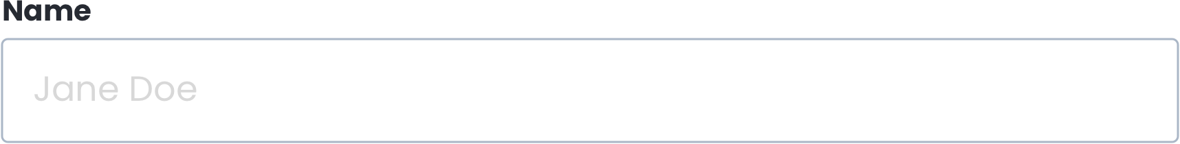
Form Fields Edit

Notes Edit
Iconography
Working file for icons. This file also has the pergola illustration in it. (I can’t find the file I created the basketball hoop in, so please reference the homepage R5 for the latest version of that if you need it.): ASM_icons.ai
I’ve been referencing this library (Graphic Pear) or Noun Project as a starting point when building these: https://www.dropbox.com/sh/o3v8ftzwsbq4e0q/AAClK_mQuCHk0wVnM_fk-bFYa?dl=0
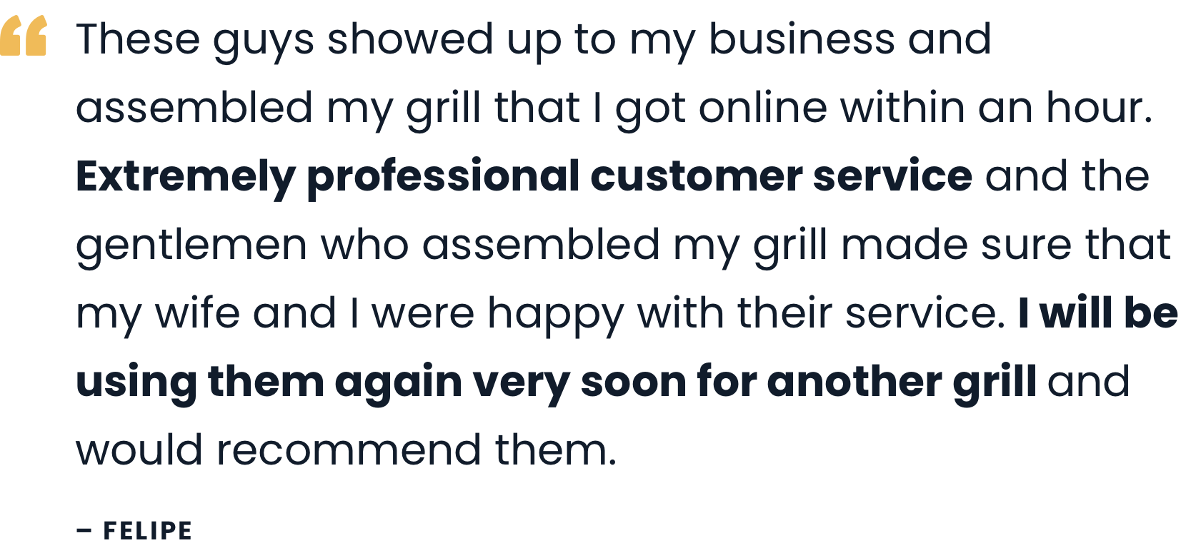
Photography
Here are some photos the client sent: https://www.dropbox.com/sh/ckp4clzsegkgpho/AACzSFTj5RuIEpiQli30BpAya?dl=0
I’ve also been screenshotting photos from their Instagram, since they don’t have many photos to select from in the folder above: https://www.instagram.com/assemblersinc/?x=81&y=42
They don’t like using stock unless you can’t tell it’s a stock photo. For example, the image of the guy repairing the bike above the contact form is stock and they’re okay with using it because it’s hard to tell. However, the client commented that the man was almost too attractive — we convinced her that this was okay, but try to find photos that feature average-looking people.
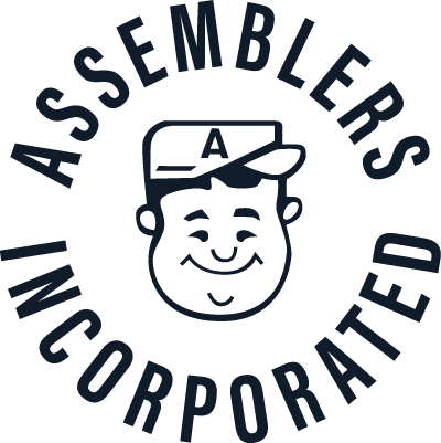
Brand Guide
This basically states all the same things as this style guide, but here’s the link to it in case it’s helpful. It gives a bit more context around how to construct the layered graphics in use on the website: https://www.dropbox.com/s/3y718en9eug6t6f/ASM_BrandGuide_am_1a.pdf?dl=0
Comment
Primary logo, used in main navigation. Looks best on a white background.